Our doors are always open
Email us: info@bdesign.com.mt
Call us: +356 7944 2732
Opening Hours
Monday – Friday, 9:00 to 17:00
Other hours available by appointment.


I am sure that by now you have noticed that one of the Trends in 2022 is shouting GREEN in all its forms.
We are seeing green being used all around our homes and commercial spaces alike. This look can be created by a mix of plants, vertical walls, painted walls and soft furnishings.
Our instinct to connect with nature and other living beings has brought about this trend and we are making sure to follow it.

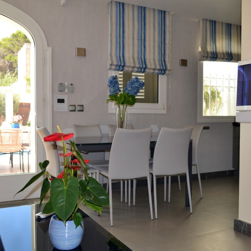
Visualizer: Bdesign
Get The Look: Fabric for Roman Blinds- Bird of Paradise Teal collection by Bdesign ; Armchairs by Protrade Décor; sofa especially designed by Bdesign interior design studio and custom made.
Green’s complimentary colours are derived from red and orange hues therefore the burnt orange colour on the armchairs has created an energizing design aesthetic when combined with the green and white patterned fabric on the roman blinds.

photo courtesy of : Bdesign interior design studio
Get The Look: Fabric for Sofa by Prestigious at One Two One Interiors;
The muted green sofa is the perfect combination to an otherwise neutral backdrop. It's amazing how a pop of colour in one accent piece can tranform an otherwise dreary enviornment.


If you’re thinking green is the way to go in your bedroom, find a colour that induces tranquillity. Green with blue undertones is a great choice for the bedroom.
What the Experts are saying:
“I am not a fan of yellow-green or chartreuse greens,” advises Fisher. “I feel it’s a little harsh for a living space and isn’t a flattering color. Stick to your warmer undertones that are flattering and look beautiful.”
“I think it’s best to avoid garish, bright greens—such as grass green—as they do not carry the same energy as the more muted earth tones,” Hardin says.
“The only greens you want to avoid are shades like lime green or neon green,” adds Purzycki. “Every other green is pretty much fair game.”
Did you like this article?
Your feedback helps us improve.
Email us: info@bdesign.com.mt
Call us: +356 7944 2732
Opening Hours
Monday – Friday, 9:00 to 17:00
Other hours available by appointment.